Wednesday, 21 October 2015

finalized

 Below are my final design ideas and colour schemes. i finally decided on which initial sketch i wanted to pursue and i played around with different variations of shapes, colours, fonts and backgrounds. The last 2 are the final designs. The largest one being just the logo.

Here was the final design i went with but i had to go through a lot of editing to find which design and colour scheme i preferred, above was the original idea. I played around with fill colour, height, width, size and curves and i really liked the fill of the second design but the shape of the fourth design so i decided to make additional changes below.

Here were the other designs i created shortly after analysing the previous designs. here i experimented with colours which none of them worked in my opinion so i decided to try the design with a background and having the logo itself as a white fill. I thought this worked very effectively as it was eye catching but i thought that it could still be better so i decided to experiment further (below) to get an outcome i was happy with.


Above i experimented with different backgrounds, colours, borders, surrounding shapes and even added the name of the company which i tried with two different fonts, one of which was bold. I did not personally like this and did not pursue this design so i went back to basics.


These designs were a random spark of madness, i researched more into company designs and found some used gradient overlays to make the design look more eye catching. With this in mind i decided to try incorporate this into my logo just as a test to see what the results would be. I made somewhat of metallic looking design which is found very off-putting but i was glad i took the time to experiment with this sort of design.
Finally i went back to the design i found to be my favourite and took a step back and realised that the initial shape of the logo wasn't fluid enough and knew it needed to be edited. O felt that the design needed to flow better as more of a circular have as i felt it would make the logo look more professional thus making it look more appealing to company/potential clients.

This was the outcome of my company logo.


Sunday, 18 October 2015

More logos

Here's a few other designs i've worked on. After this stage i'll be finalizing one design (was playing around with a few shapes and gathering feedback to further improve these sketches before finalising which design i want to develop further.

this design was my favourite for many reasons, because the shape is unique, it can easily be identified as the letter D and it can be further improved to portray the company name 'divide'. I liked the shape of this design as it reminds me of a fish which is quite unique given that the company is a design company and i've found that something companies use animal shapes/designs/silhouettes in their logos such as these companies.

-
 Below are more shapes i created just using various tools within illustrator, I like the curves but as a whole I dislike the overall look of these designs and most likely won't be using them as a final design.


Thursday, 15 October 2015

Website


Inspiration

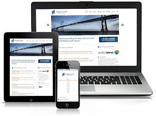
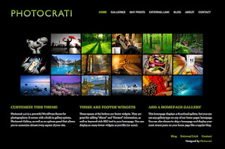
Here are a few webpage design ideas which I've found on Google.


Website Templates

Button's and Mood Board


Website Screenshots


Business Cards


Inspiration  

Here are some inspiring business cards that I have found using the internet...  These will help to give an idea into the colour and the style of our business cards.


colour palates
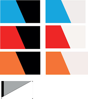
As we spoke about with the layout of our business cards. I have produced them in different colours which can be discuss which one would fit for are business. 


Layout design- Mock ups. 

Here are some quick hand drawn mock ups of how our business cards could look.


The golden ratio
The golden ratio is something that a designer can use to help to give a level of composition within our design work.  It is also know and to be based around the Fibonacci sequence. These Fibonacci number are then used to form a rectangular guide which can allow us to create some great design work.  


Here below is an example of the golden ratio being used to create a business card. As we can see the golden ration helps to give that composition and space within our design work. 


Fonts for business card

kerning allows us to adjust space between each individual letter while adjusting the space between each letter.Myriad Pro is a  high readability font. It gives a clean and neat look of the uppercase letters and the rounded tails such as on the Y gives of a stylish and professional look. The font can be used in several styles such as extended,light and semi-bold. When using the kerning tool on this it allows the font to still be readable and not making the whole font with in a design look like a mess. 


Progression 


The design used in different reds

More designs 


Tuesday, 13 October 2015

Branding Logos

Here are a few images i found when looking for inspiration when designing this logo. I dissected the name and tried various approaches. This is what i have so far and will be developing a few of them over the next few days.


I particularly liked these logos as they were very minimal. Also i find that way they incorporated objects that related to the band's name very effect and i wanted to created something with the same style.


I really liked the look of these logos because of their letterforms. I loved how the illustrators turned letters into illustrations but kept their message clear as well as delivering their message to their audience. take the anti particle logo for example, they contracted the letter A using circles which represent particles whilst adding a blue circle which clearly stands out. This represents the anti particle within the other particles thus keeping the letterform and keeping the logo relevant.

Here is a page of my initial sketches. I personally like 3 of these designs due to their minimalism and letterforms. My favourite amongst them was the logo in the shape of the letter D but also including the shape of the mathematic division icon. The only issue i can find with this design is it could easily be misinterpreted as a percentage sign instead depending on how i develop this idea.